


So, I recently bought this game called TCG Card Shop Simulator, personally, I'm not a Simulators player myself, I don't get much enjoyment from playing stuff like Farm Simulators, or The Sims nowadays, I prefer sitting down and playing a cool Roguelike, or a hard as balls platformer, but this, I had to play it, I saw my favorite Hearthstone Youtuber Rarran play it and it looked so damn fun, and the fact I always dreamt of owning a TCG/Board games shop was also a factor that attracted me, and so far, the game has been mad fun for me. At the beginning of it, I had to name my Card shop, and what did I call it? I just thought this for like, 10 seconds, 8 of them was just me laughing my ass off...
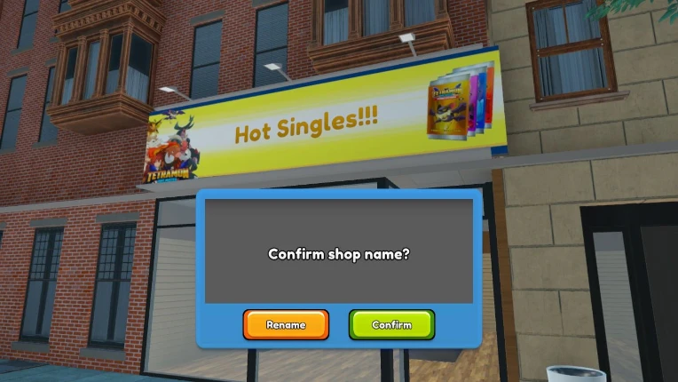
It is so stupid, but, as I was playing and kept looking at it, I thought how much I hated how bland it looks, I don't really enjoy looking at that Frutiger font looking ass banner with the silly Pokémon copycat clip art the game has... So I thought... How would I make my OWN card store look like? After all, I'm a graphic design graduate, let's give it a proper identity based on the childish joke I made. And so I took my little pages put together with a stapler I like to call "Sketchbook" and start drafting quick ideas.
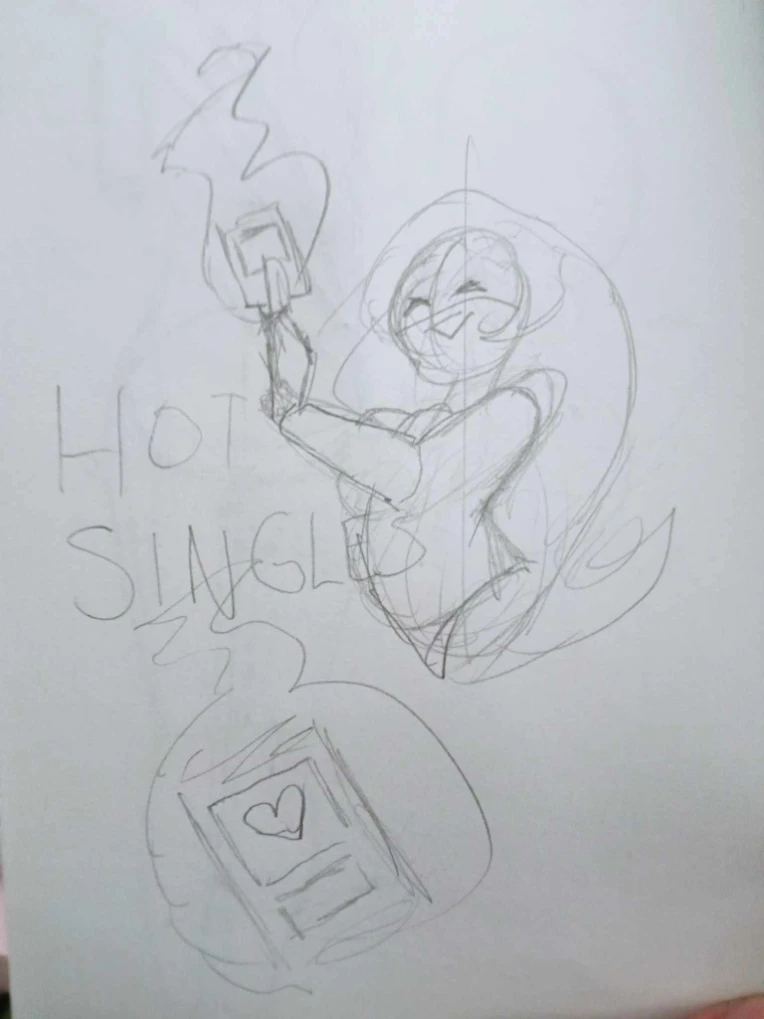
I kept playing with the concept of HOT and SINGLES, and if you have ever consumed porn in this hellhole known as the Internet, you'd more likely stumbled on a shady ad offering you to meet with HOT SINGLE WOMEN in your area, so I also had to play with the idea of HOT WOMEN, it was a tall order as some logos just have one element or two merged together, rather than three, like this case. But I ended up going for the most unique one, which was the hot lady holding the card on fire, I know it could be done differently, but being honest, I have a hard time "Killing my darlings", so I went with this one.
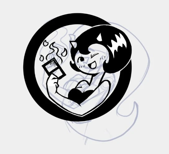
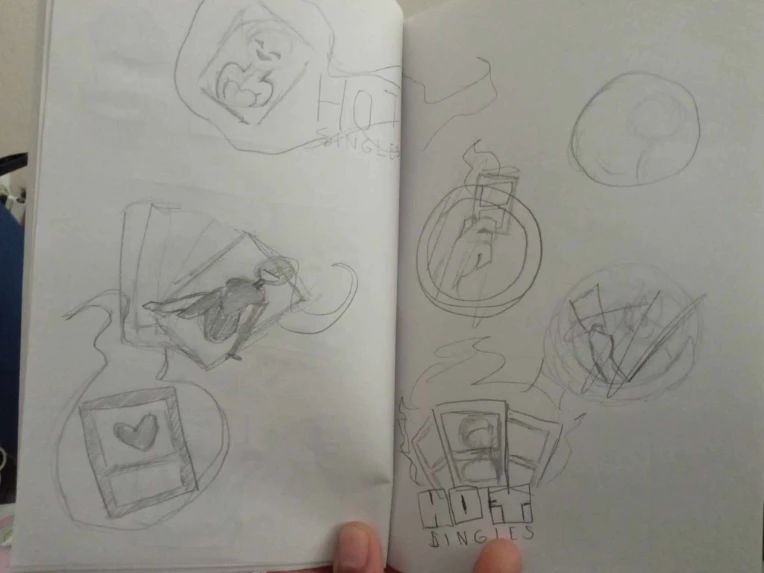
I simplified it enough to make it more readable and with less elements, I added some horns to her cuz I love hot demon chicks, and a circle around instead of hair, as I thought of that iconic Simpson's logo for the Hellfish Squad, but maybe that format wasn't that helpful as it wasn't roundy enough, you know? It needed some movement, so I thought maybe something static like a square could work.
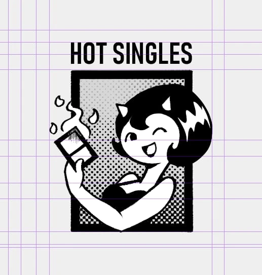
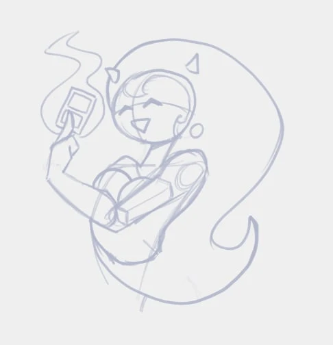
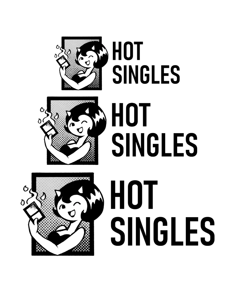
And it kinda did, I also fixed the hand and reduced her head as it was very disproportionated. I love how the V shape of her arm looks and I added the term HOT SINGLES using a condensed bold version of the Banschrift font, for the limit of the logo, I used the little space in the E as X's height. one time X felt enough space for the logo without the picture losing pressence.
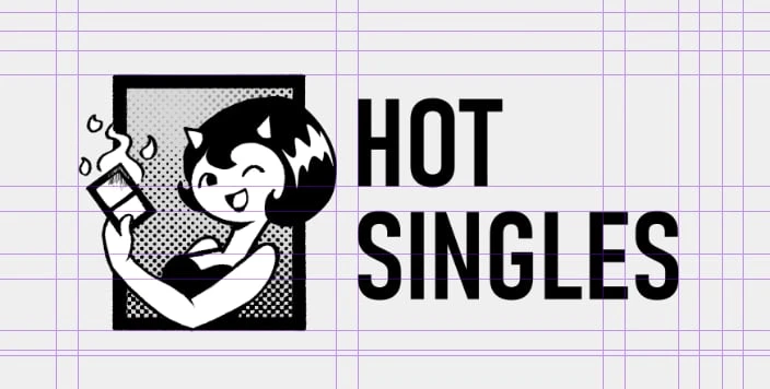
"Hey, but weren't you making it because of a banner?" Obviously! I also thought about it, keeping the X-height, I feel this one works a little, bettr, I genuenly love brands with a logo and the company's name properly spaced. Imo, I still gotta work with that T in HOT and the SIN part feels a little too tight compared to LES, but, Oh well, this is just me documenting my process so far, one can always improve it.
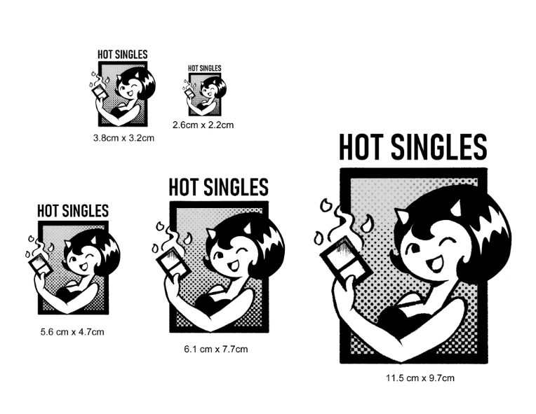
Next step was making sure resizing the logo makes it so some visual information isn't lost. I did a few tests.
And as always, you can't trust your screen, so I printed it.
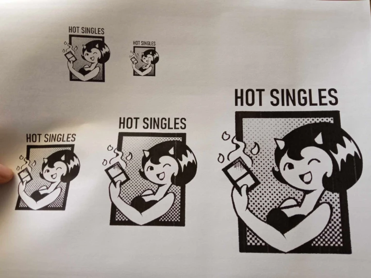
So far I like the results, not too much is lost in the smallest size, although I either would edit some stuff or maybe change the smallest permitted size of the pic to something a little bigger (Like the top left one); the halftone gradient helps black and white elements to stand out, I like that. I want to work on the T and O of HOT as I mentioned and, I know I mentioned the SIN in SINGLES feeling tight, but on second look, I kinda like it.
I might work on a colored version, I personally don't like to fuck too much with coloring when it comes to graphic design but if you don't try out shit in life, you'll never succeed. So yeah. Hope you guys like it, also any suggestion or observation is appreciated. I know I studied Graphic design but I am more of an illustrator myself (That's why I made this in Clip Studio and not Adobe Illustrator, lmao).
SevenChakras
if I ever open a card shop, I know exactly where to go for a logo lmfao
TheGarbager619
"Yes, hello. I'd like to buy these HOT SINGLES."
And it is just cut outs of the Vogue magazine